Healthy Bits
A complete brand and eCommerce presentation system for a healthy snacks brand, designed across packaging, print, signage, mobile, and web to create a consistent customer experience.
Case Study
Overview
Healthy Bits needed more than a logo refresh. The brand had to feel shelf-ready, web-ready, and memorable across every first impression, from packaging to product browsing.
Challenge
The core challenge was consistency. The same identity had to work on snack packaging, signage, flyers, lifestyle mockups, and ecommerce screens without becoming repetitive or losing clarity.
Approach
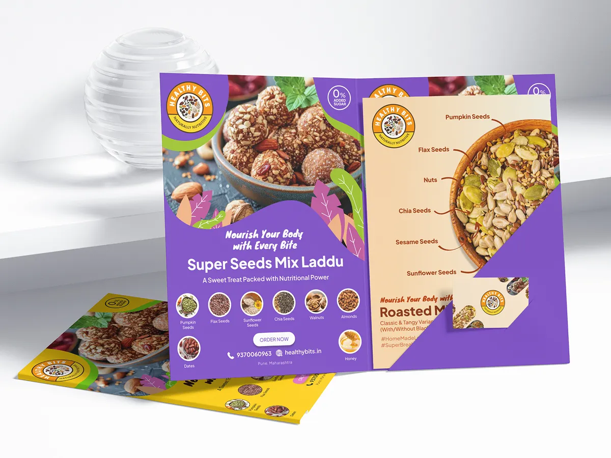
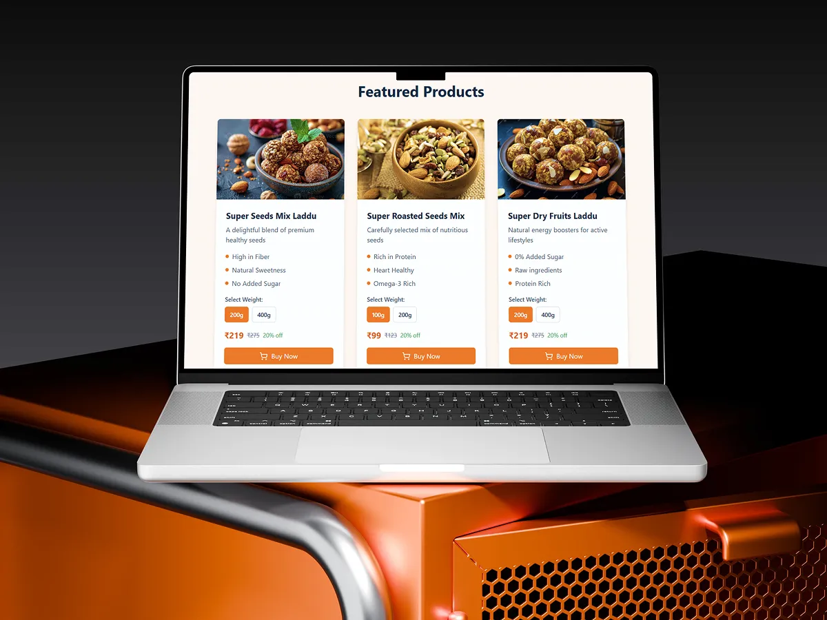
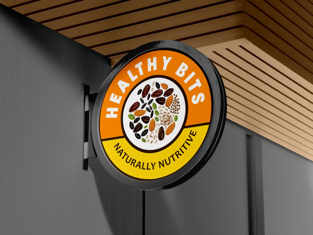
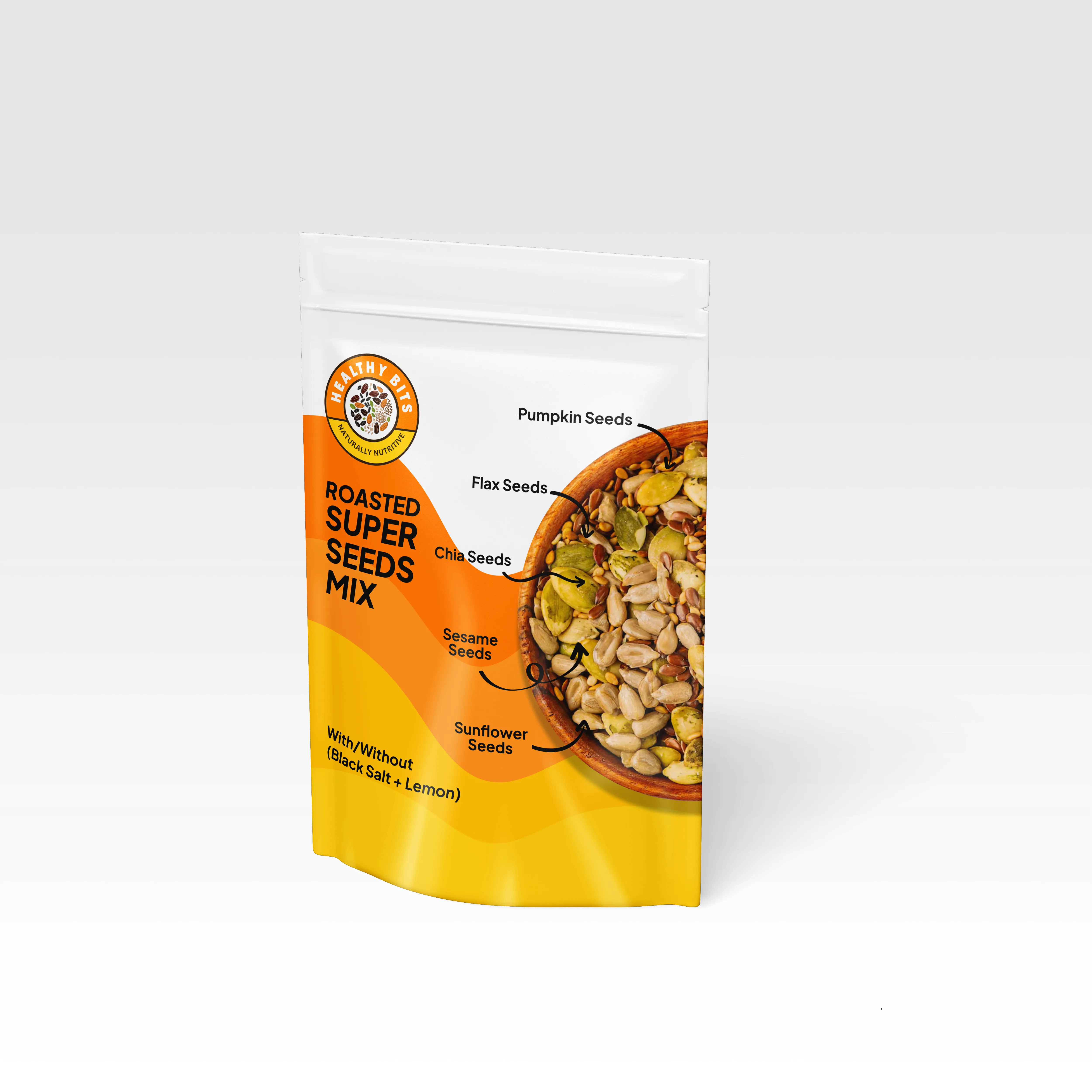
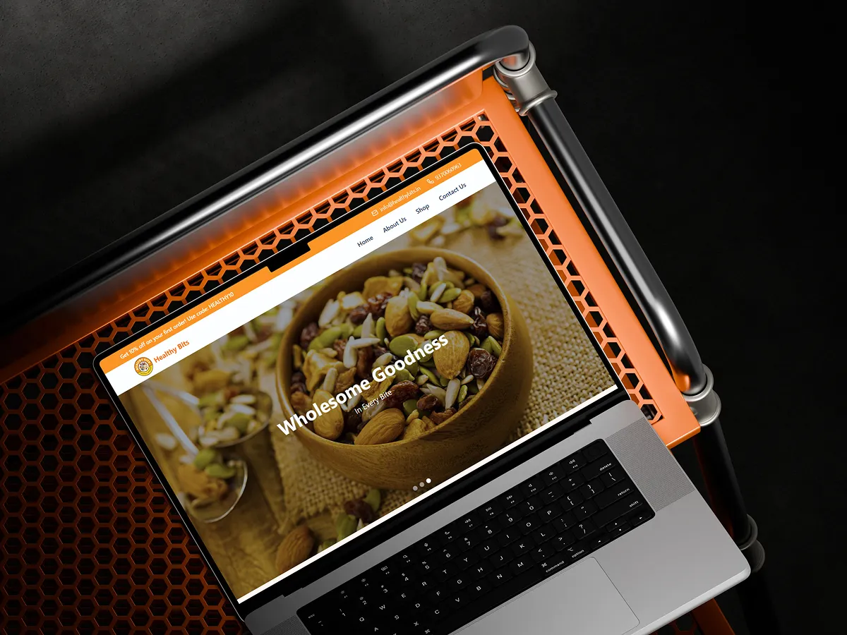
We built the system around a distinctive circular mark, a warm nutritional palette, and food-forward photography. Layouts stay modular so new product shots, ads, and pages can plug into the same design language with minimal redesign.
Deliverables
- Logo-led visual identity
- Retail-ready pouch packaging
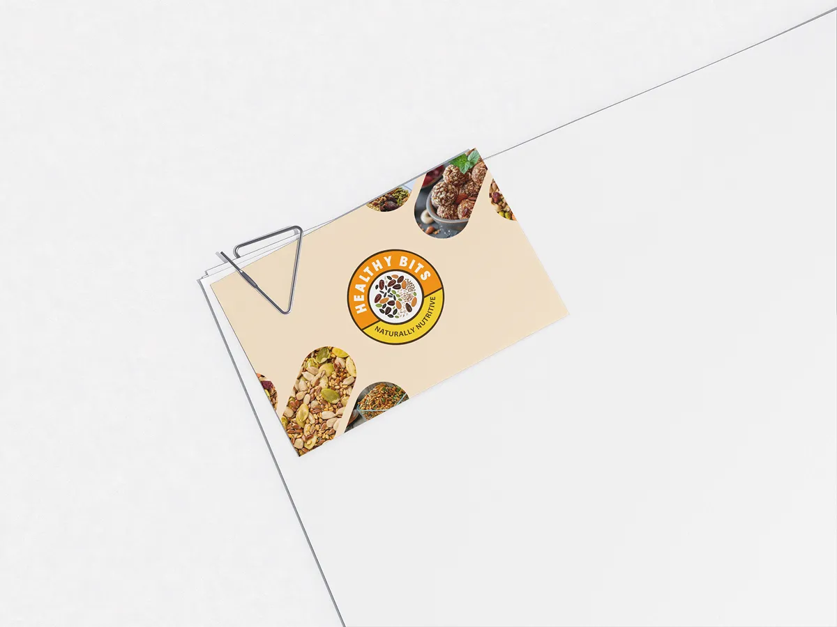
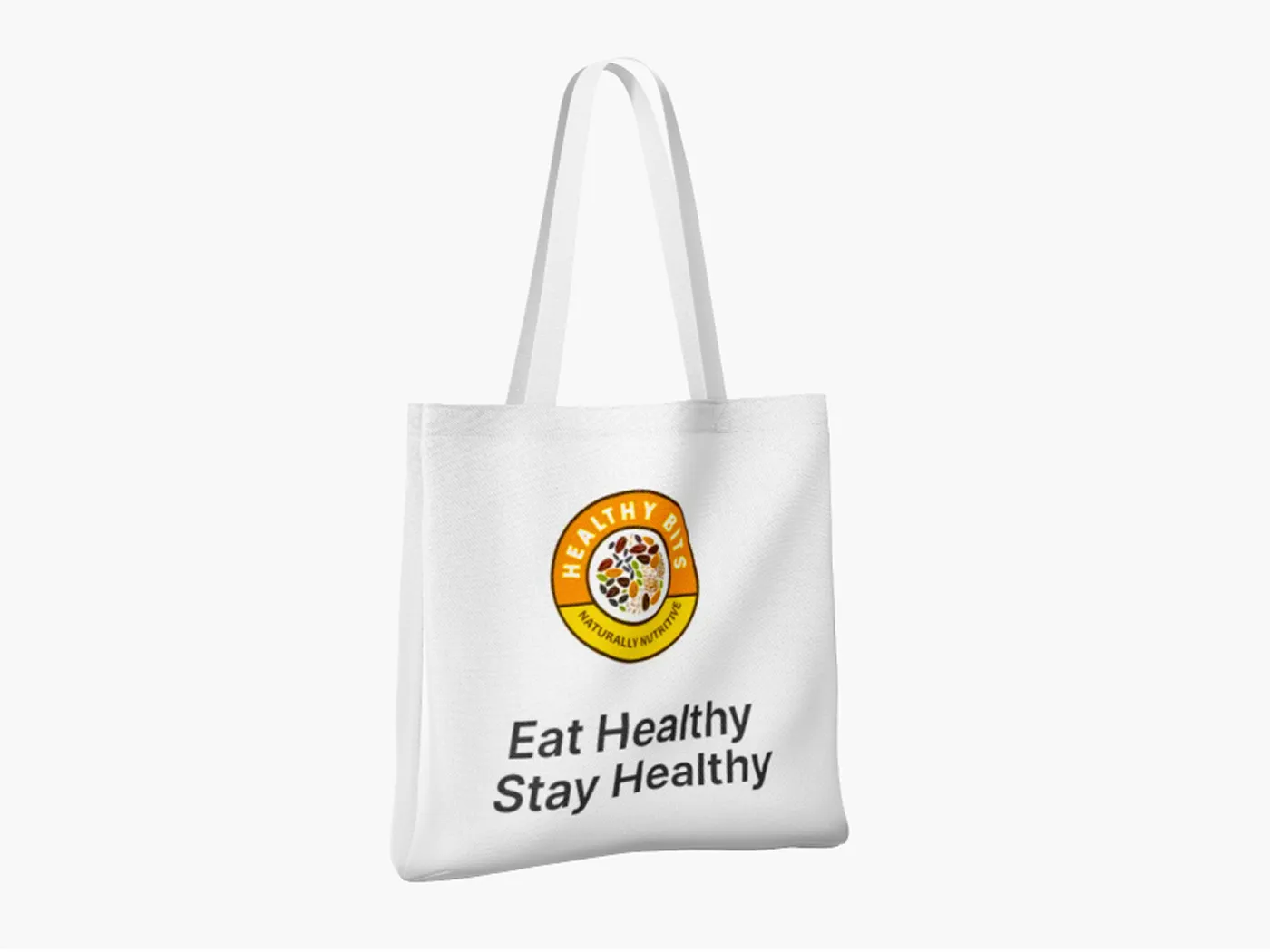
- Branded print and tote assets
- Desktop storefront concepts
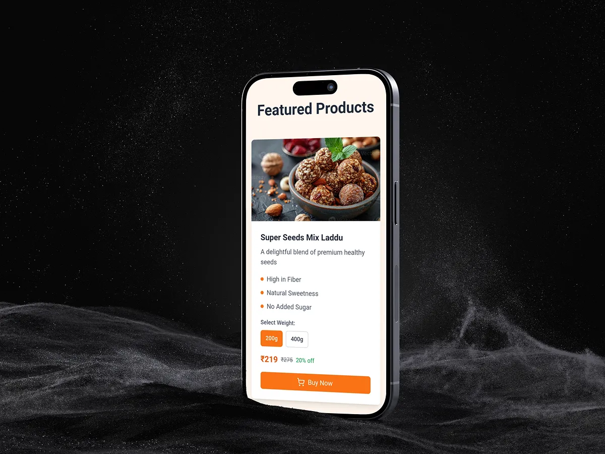
- Mobile product purchase screens
What This Project Solves
- A unified visual language that holds together across physical and digital touchpoints.
- Ingredient-first artwork that makes the product benefits instantly legible.
- A launch-ready gallery of brand assets that can keep expanding with new SKUs and campaigns.
Project Gallery
Healthy Bits across every touchpoint.